
A Crash Course in color theory
By: John Silva – March 2016
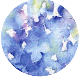
The challenge was to write a story that centered on a totally random word… I chose Blue.
Abraham Lincoln said you can fool all of the people some of the time and some of the people all of the time. But, you can’t fool all of the people all of the time. When discussing color, absolutes are hard to come by. Most of the time the most we can hope for are guidelines that work some of the time. On a good day, maybe they work most of the time. To state this clearly, when it comes to color theory there are no absolutes that work all of the time. That pretty well sums up color theory and life.
Before, we begin. Have you noticed that in many ways color is like life… think about it.
Hue: describes the six “pure” colors…red, orange, yellow, green, purple & blue you get when you separate white light into its hues (think rainbow). For example, turquoise is a color but not a hue; Intensity: “pure” blue has full intensity… Adding a thinner dilutes it, and you get the color of old faded blue jeans; Value: When you tint “pure” blue with white and it makes the color lighter like baby blue. When you shade “pure” blue with black it makes the color darker like navy blue.
With over two million colors, how does one choose what colors to use where? One easy system is to organize colors by using age. Color schemes for children can use any or all of the six hues. For teenagers use pastels i.e. powder blue, peach, etc. For adults use earth tones like burnt orange or moss, etc. And, for seniors use the deep tones like maroon, navy, deep purple, etc. Mixing colors from different age groups i.e. fire engine red for children, and powder blue for teenagers, and moss for adults may limit positive results.
A rainbow scheme uses all of the hues. Another color scheme uses cool colors i.e. green, blue and purple or warm colors i.e. red, orange and yellow. Complimentary color schemes blue and orange, red and green, and purple and yellow are opposite each other on the color wheel and if mixed together they cancel each other out and make a tan color. Tints and shades of only blue are monochromatic, and analogous schemes use two adjacent hues on the color wheel like yellow and orange. Seasonal themes could be pastels for spring and earthy colors for fall. Special holidays like the Fourth of July, Christmas, Halloween, etc. have their own schemes. White, black, gray and brown are neutrals and go with most color schemes or by themselves like black and white tuxedos.
If your blue car is in the garage without any lights on, you can’t tell it’s blue. You can only see the blue if you put on a light. When it’s in the light, the blue hue is reflected and all others are absorbed…so you see blue. Color key: R=Red, B=Blue, Y=Yellow, G=Green, O=Orange P=Purple, Rules for mixing paint:
- R+B=P,
- R+Y=O,
- B+Y=G,
- R+Y+B=Brown,
- R+G, Y+P, and B+O = Warm Grey,
- Add Black or White = Cool Grey.
Inkjet printers use CMYB [cyan, magenta, yellow and black].
Four color printing presses use CMYK [K is short for Key which is black]…
Paint and ink can only reflect color which is a subtractive process because all of the other colors are not reflected.
On the other hand, colored light is different. It is an additive process because when you shine a green light on a white sheet of paper it turns the paper green.
Wikipedia states “Blue is the color between violet and green on the optical spectrum of visible light. Human eyes perceive blue when observing light with a wavelength between 450 and 495 nanometres . Blues with a higher frequency and thus a shorter wavelength gradually look more violet, while those with a lower frequency and a longer wavelength gradually appear more green. Pure blue, in the middle, has a wavelength of 470 nanometres [a nanometer equals one billionth of a meter].” Note: Computer screens emit red, green & blue light which follow additive rules R+G=Y, G+B=Cyan, R+B=Magenta, R+G+B=White. This information is essential knowledge for theater and television studio lighting. Mixing colored light is different from mixing paint.
Scientists say, we can see over 65,000 shades of blue…which makes it easy to see why every shade of blue has a number and not a name. But, here are a few names for shades of blue: Air Force, azure, baby, blue-gray, cerulean, cobalt, cornflower, cyan, dark, denim, electric, federal, indigo, light, medium, dark, midnight, Navy, non-photo, ocean, periwinkle, phthalo (one of the darker shades of blue), powder, prussian, royal, sapphire, sky, steel, teal, tiffany, turquoise, ultramarine, union, violet-blue and zaffre (another darker shade of blue).
Cheyenne
Now…segue with me…from the realm of science…to a strange story of sentient art. Cheyenne drenches the stretched watercolor paper and begins painting with her blues wet-in-wet style. As she drops various shades of the blue pigments from her palette onto the wet paper, she is mesmerized as the paint diffuses and bleeds into fascinating shapes and beautiful nuances. By letting the layers of paint dry and then going over them again with different shades of blue, she creates a layered effect called glazing, and by letting water or paint fall onto the dried painted areas she makes distinctive watermarks.
She knows that to get a sharp edge, the paper has to be dry and the brush wet. If she wants a soft edge the paper must be damp so the color will bleed. With a dry brush and just a smidge of pigment, she can burnish the paint to make it darker. Whipping her wet brush at the paper, she can produce a row of dots of decreasing size. In her trance-like state… she is oblivious to the outside world. Images appear and disappear. Lions, unicorns and dragons come and go as she falls deeper into oblivion. She’s agitated because the images keep changing their shape. They insist on running about the painting rising up and falling down, slipping and sliding between the cyan skies and the flashing electric blue rainbows.
Cheyenne, now thoroughly consumed by her art, lets herself drip into the painting a drop at a time. She swims in the deep prussian blue pools, and splashes the amorphous shapes into other shapes until she and her creation are fused into a single entity. Watching from behind the midnight blue veil… she wraps herself in swaths of cool ultramarines and violets. She conceals herself and hides within the great swirling teal and turquoise images. She wraps herself in the huge indigo sheets… and she trades her red blood for an beautiful electric blue plasma which flashes as it surges through her veins and arteries. She dances with the silky curtains soaked with zaffre hues, and she silently hovers, cloaked in a shroud of deep cerulean blue… she watches and waits in her monochromatic state of pure ecstasy.
Postscript…
If you find yourself in an art gallery, and you aren’t aware of how you came to be there and you are fascinated by an elaborately complicated and alluring blue painting… slowly… ever so slowly… backup… turn around… and… run!!!